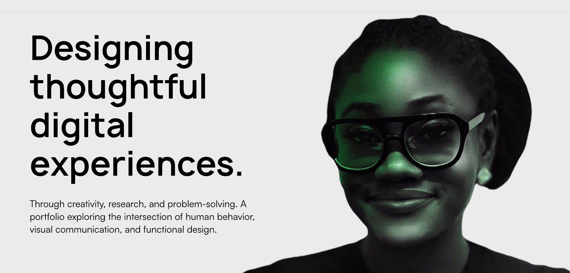
Designing thoughtful digital experiences — Ifeoma Nwokporo's UX portfolio
Through creativity, research, and problem-solving. A portfolio exploring the intersection of human behavior, visual communication, and functional design.
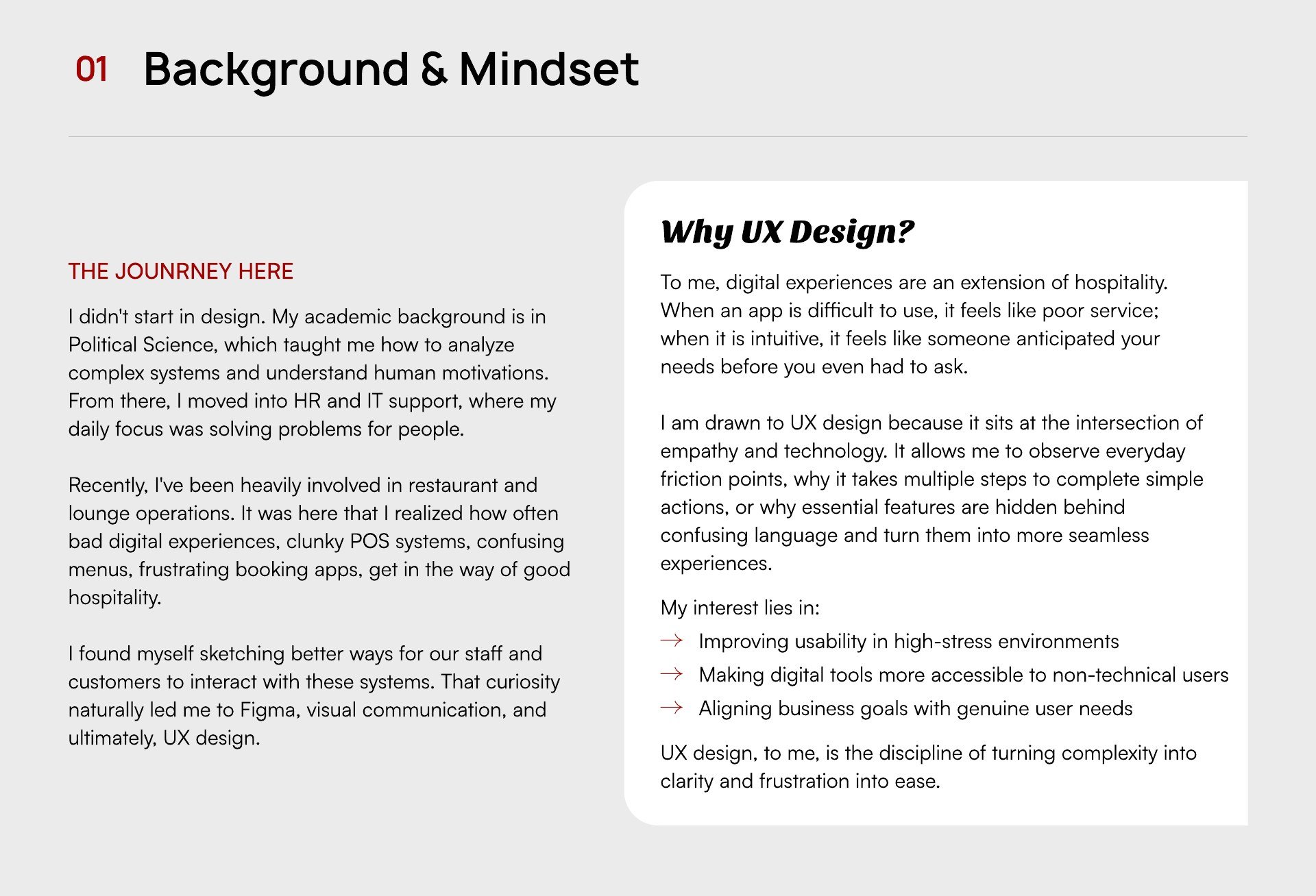
01. Background & Mindset
The Journey Here
I didn't start in design. My academic background is in Political Science, which taught me how to analyze complex systems and understand human motivations. From there, I moved into HR and IT support, where my daily focus was solving problems for people.
Recently, I've been heavily involved in restaurant and lounge operations. It was here that I realized how often bad digital experiences — clunky POS systems, confusing menus, frustrating booking apps — get in the way of good hospitality.
I found myself sketching better ways for our staff and customers to interact with these systems. That curiosity naturally led me to Figma, visual communication, and ultimately, UX design.
Why UX Design?
To me, digital experiences are an extension of hospitality. When an app is difficult to use, it feels like poor service; when it is intuitive, it feels like someone anticipated your needs before you even had to ask.
I am drawn to UX design because it sits at the intersection of empathy and technology. It allows me to observe everyday friction points — why it takes multiple steps to complete simple actions, or why essential features are hidden behind confusing language — and turn them into more seamless experiences.
My interest lies in:
- Improving usability in high-stress environments
- Making digital tools more accessible to non-technical users
- Aligning business goals with genuine user needs
UX design, to me, is the discipline of turning complexity into clarity, and frustration into ease.
02. UX Case Study
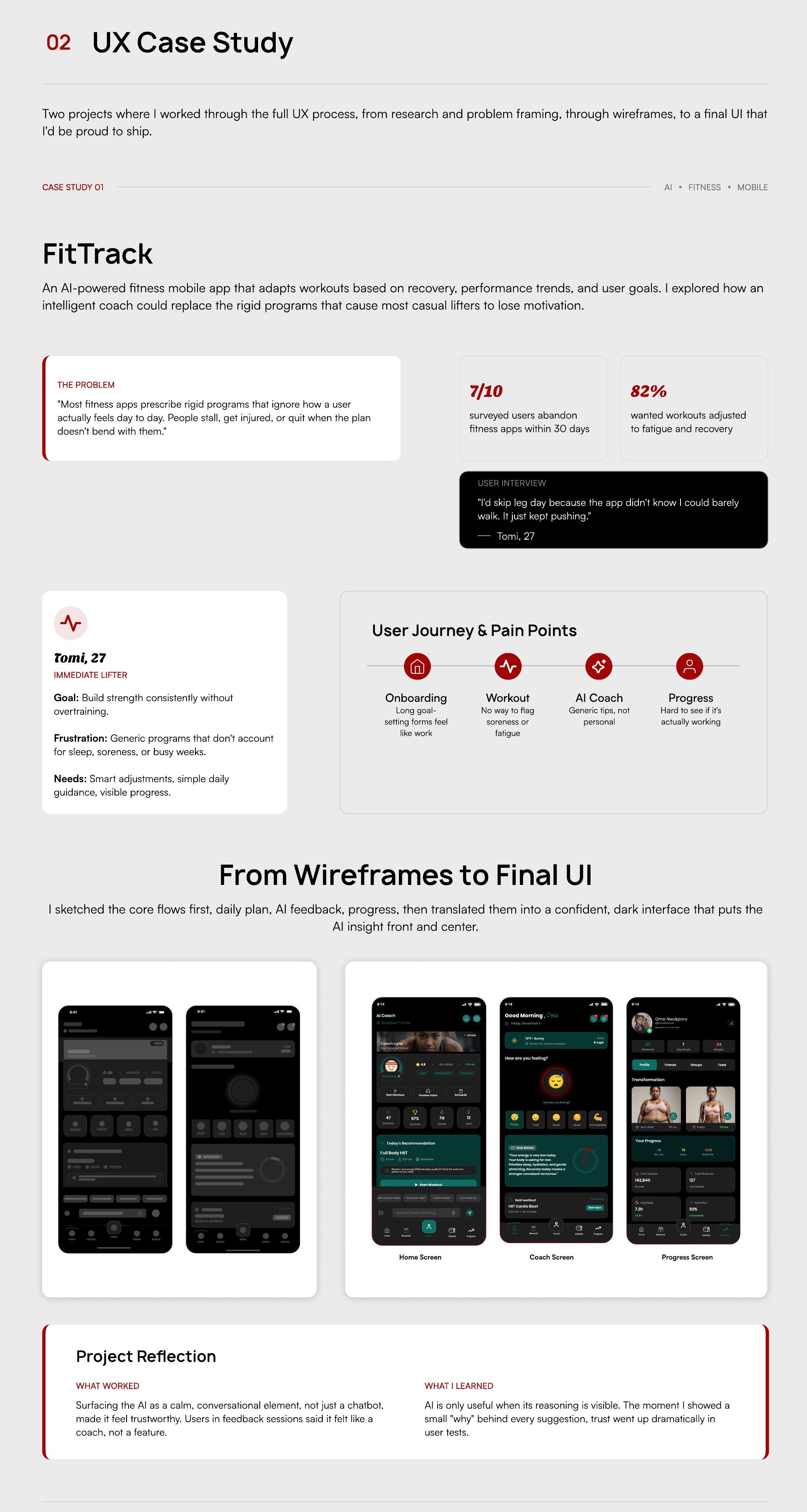
Two projects where I worked through the full UX process — from research and problem framing, through wireframes, to a final UI that I'd be proud to ship.
Case Study 01: FitTrack — AI, Fitness, Mobile
An AI-powered fitness mobile app that adapts workouts based on recovery, performance trends, and user goals. I explored how an intelligent coach could replace the rigid programs that cause most casual lifters to lose motivation.
The Problem
Most fitness apps prescribe rigid programs that ignore how a user actually feels day to day. People stall, get injured, or quit when the plan doesn't bend with them.
- 7 in 10 surveyed users abandon fitness apps within 30 days.
- 82% wanted workouts adjusted to fatigue and recovery.
User interview: “I'd skip leg day because the app didn't know I could barely walk. It just kept pushing.” — Tomi, 27
Persona — Tomi, 27 (Immediate Lifter)
Goal: Build strength consistently without overtraining. Frustration: Generic programs that don't account for sleep, soreness, or busy weeks. Needs: Smart adjustments, simple daily guidance, visible progress.
User Journey & Pain Points
- Onboarding — long goal-setting forms feel like work.
- Workout — no way to flag soreness or fatigue.
- AI Coach — generic tips, not personal.
- Progress — hard to see if it's actually working.
From Wireframes to Final UI
I sketched the core flows first — daily plan, AI feedback, progress — then translated them into a confident, dark interface that puts the AI insight front and center.
Project Reflection
What worked: Surfacing the AI as a calm, conversational element — not just a chatbot — made it feel trustworthy. Users in feedback sessions said it felt like a coach, not a feature.
What I learned: AI is only useful when its reasoning is visible. The moment I showed a small “why” behind every suggestion, trust went up dramatically in user tests.
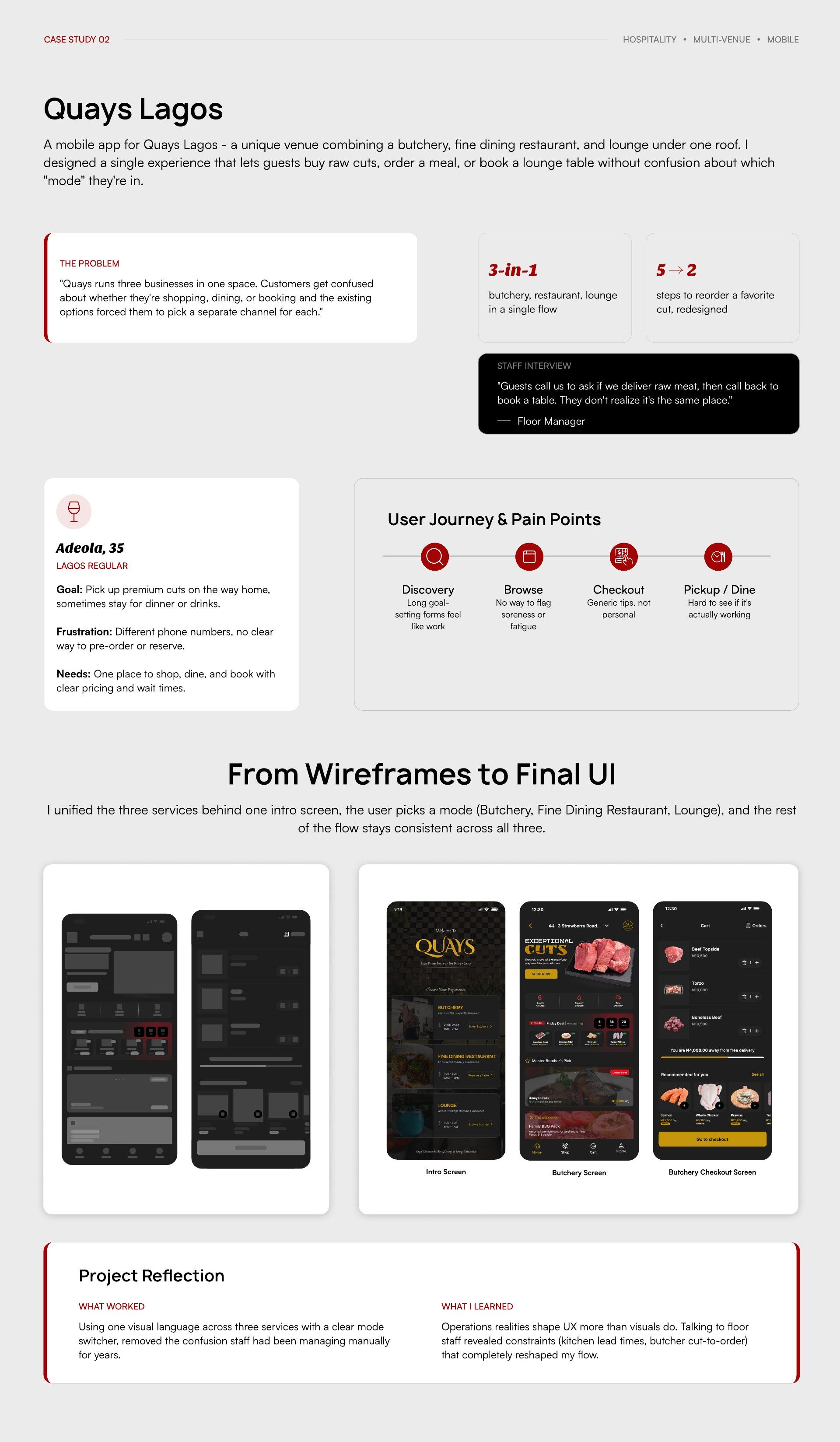
Case Study 02: Quays Lagos — Hospitality, Multi-venue, Mobile
A mobile app for Quays Lagos — a unique venue combining a butchery, fine dining restaurant, and lounge under one roof. I designed a single experience that lets guests buy raw cuts, order a meal, or book a lounge table without confusion about which "mode" they're in.
The Problem
“Quays runs three businesses in one space. Customers get confused about whether they're shopping, dining, or booking — and the existing options forced them to pick a separate channel for each.”
- 3-in-1: butchery, restaurant, lounge in a single flow.
- 5 steps to reorder a favourite cut, redesigned.
Staff interview: “Guests call us to ask if we deliver raw meat, then call back to book a table. They don't realize it's the same place.” — Floor Manager
Persona — Adeola, 35 (Lagos Regular)
Goal: Pick up premium cuts on the way home, sometimes stay for dinner or drinks. Frustration: Different phone numbers, no clear way to pre-order or reserve. Needs: One place to shop, dine, and book with clear pricing and wait times.
User Journey & Pain Points
- Discovery — unclear what services are available.
- Browse — different channels for each venue.
- Checkout — no unified payment.
- Pickup or dine — hard to coordinate.
From Wireframes to Final UI
I unified the three services behind one intro screen — the user picks a mode (Butchery, Fine Dining Restaurant, Lounge), and the rest of the flow stays consistent across all three.
Project Reflection
What worked: Using one visual language across three services, with a clear mode switcher, removed the confusion staff had been managing manually for years.
What I learned: Operations realities shape UX more than visuals do. Talking to floor staff revealed constraints (kitchen lead times, butcher cut-to-order) that completely reshaped my flow.
03. Visual & Brand Design
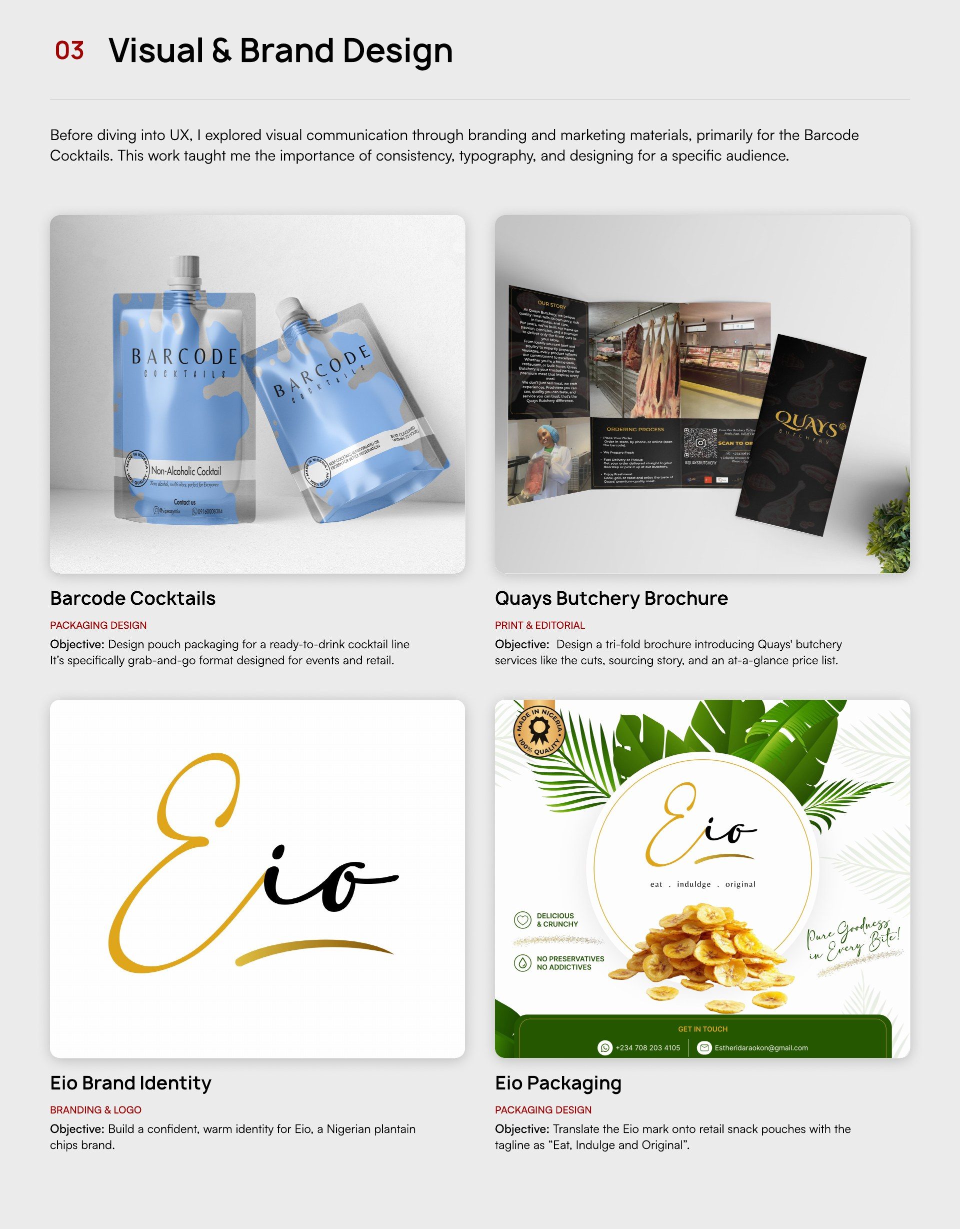
Before diving into UX, I explored visual communication through branding and marketing materials, primarily for Barcode Cocktails. This work taught me the importance of consistency, typography, and designing for a specific audience.
Barcode Cocktails — Packaging Design
Objective: Design pouch packaging for a ready-to-drink cocktail line — a grab-and-go format designed for events and retail.
Quays Butchery Brochure — Print & Editorial
Objective: Design a tri-fold brochure introducing Quays' butchery services — the cuts, sourcing story, and an at-a-glance price list.
Eio Brand Identity — Branding & Logo
Objective: Build a confident, warm identity for Eio, a Nigerian plantain chips brand.
Eio Packaging — Packaging Design
Objective: Translate the Eio mark onto retail snack pouches with the tagline “Eat, Indulge and Original”.
04. Research & Process
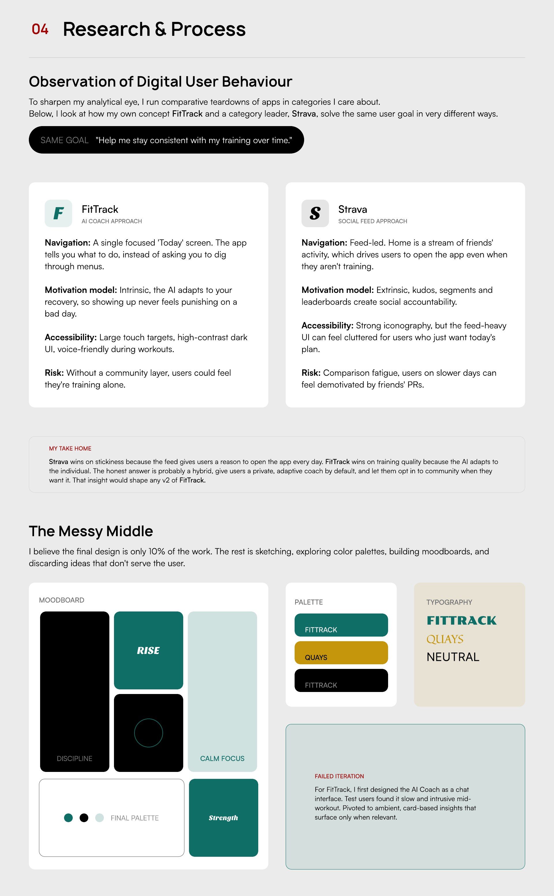
Observation of Digital User Behaviour
To sharpen my analytical eye, I run comparative teardowns of apps in categories I care about. Below, I look at how my own concept FitTrack and a category leader, Strava, solve the same user goal in very different ways.
Same goal: “Help me stay consistent with my training over time.”
FitTrack — AI Coach Approach
Navigation: A single focused 'Today' screen. The app tells you what to do, instead of asking you to dig through menus. Motivation model: Intrinsic — the AI adapts to your recovery, so showing up never feels punishing on a bad day. Accessibility: Large touch targets, high-contrast dark UI, voice-friendly during workouts. Risk: Without a community layer, users could feel they're training alone.
Strava — Social Feed Approach
Navigation: Feed-led. Home is a stream of friends' activity, which drives users to open the app even when they aren't training. Motivation model: Extrinsic — kudos, segments and leaderboards create social accountability. Accessibility: Strong iconography, but the feed-heavy UI can feel cluttered for users who just want today's plan. Risk: Comparison fatigue — users on slower days can feel demotivated by friends' PRs.
My Take Home
Strava wins on stickiness because the feed gives users a reason to open the app every day. FitTrack wins on training quality because the AI adapts to the individual. The honest answer is probably a hybrid — give users a private, adaptive coach by default, and let them opt in to community when they want it. That insight would shape any v2 of FitTrack.
The Messy Middle
I believe the final design is only 10% of the work. The rest is sketching, exploring color palettes, building moodboards, and discarding ideas that don't serve the user.
Moodboards: Discipline, Rise, Calm Focus. Final palettes: FitTrack (Strength) and Quays. Typography exploration across FitTrack, Quays, and a neutral system.
Failed Iteration
For FitTrack, I first designed the AI Coach as a chat interface. Test users found it slow and intrusive mid-workout. I pivoted to ambient, card-based insights that surface only when relevant.
05. Looking Forward
Toolkit & Skills
- Figma
- Adobe XD
- Photoshop
- Illustrator
- Sketch
- Canva
- Wireframing
- Prototyping
- IT & Troubleshooting
- Visual Communication
- Brand Identity
- Problem Solving
- Team Collaboration
My Approach to UX Design
I approach UX design as a balance of empathy, structure, and problem-solving. I am interested not just in how products look, but in how they think, behave, and respond to human needs.
I bring a unique perspective to the cohort: an understanding of business operations, a background in analyzing human behavior through Political Science, and a genuine curiosity about how systems and people interact. This allows me to approach design from both a user and organizational point of view.
I am ready to learn, unlearn, and grow as a designer, refining my ability to translate human needs into thoughtful, usable, and meaningful digital experiences.